
The X - Experience
2020 has scarcely had a day gone by where conversations do not revolve around the unpredictable times brought to us by something too small to be visible to the naked eye and yet so potent that the entire world is reeling back from its ramifications. Crazily enough, it has pushed people to reflect, introspect, and reinvent themselves more ambitiously than the New Year’s resolutions.
At Squirro, we started our own process of change by quoting John D. Rockefeller “to turn this disaster into an opportunity”. Among our many goals was the one to produce an out-of-the-box Cognitive Search app that is standardized, intuitive to use and most importantly, has a User Experience on par with the best apps in the world. There started our journey from X to UX, where our collective experience of these testing times challenged us to design a user experience which has lock, stock, barrel and some bullets!
The UX
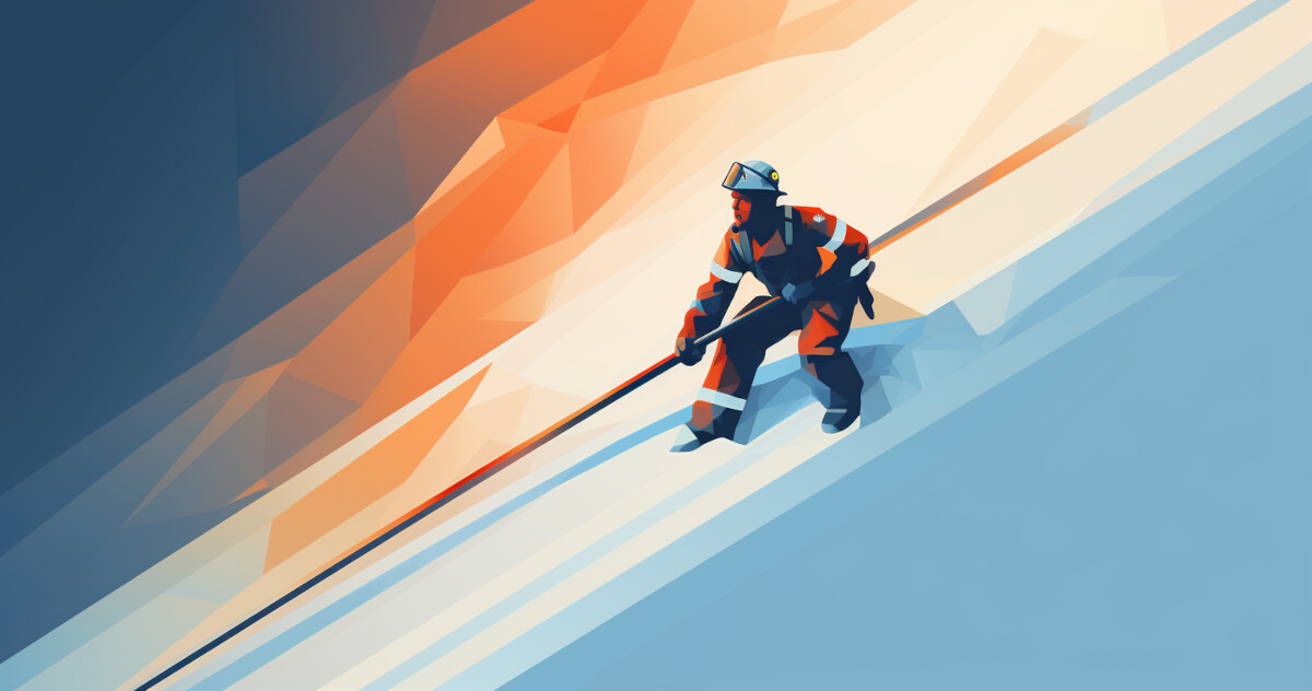
A dozen iterations and a score of cuss words later, the Cognitive Search app looked like only a distant cousin of the design we had drafted. Still a long way from the finish line, we decided to participate in Material Design (MD) Awards - an annual contest for apps that use Google’s open-source Material Design system to showcase their creativity in using MD in context of their own app. The situation reminded me of a Fireman’s pole. When firemen respond to an emergency call, they slide down a pole to quickly reach the ground floor of a fire station. Probably the only fun and play part of firefighting. Needless to say, that MD Awards was our fireman’s pole to speed us into action and have fun while we were at it.
For years, we have used MD as the design foundation for our products. It is a flexible tool that has spared us the laborious process of developing our own design system. It allows us instead to focus on ensuring consistency across all products, and to simplify them by tapping into the elements with which the user is already familiar.
We started working on a new design for our Cognitive Search app around mid-May of 2020, looking hard at its visual aspects - the colours, the style, the font sizes. The investment of time and resources involved in developing a new visual system for the app was significant, so we decided we would also take the opportunity to reinvent the Squirro style guide, which had not been refreshed in several years. Not long after, the awards came into view and it was about time that we open ourselves to be compared and judged in the design community.
As I write this post, the Awards results have not been announced yet. Win or lose, we can say that the slide down the pole was worth it!
Cognitive Search
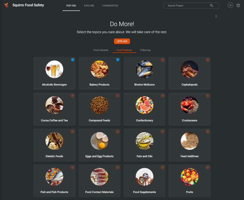
Cognitive Search is a major upgrade on Enterprise Search, using augmented intelligence to comb through structured and unstructured data from internal and external data sources in search of the most relevant and timely insights matching the interests of a given user. The first time you come to the app, you are asked to subscribe to topics of interest, so your first view is much like a ready-made newspaper, built from breaking news from your specified areas of interest. As the app matures, content categories will become increasingly sophisticated, as we flag trends, communities, most-read and most-downloaded documents.
Nowadays, almost all of us handle apps of all kinds in both our professional and personal lives, and we wanted to bring the best qualities of the apps we know in our daily lives to our powerful Cognitive Search solution. Why should a professional tool be any less attractive or intuitive than the interface of a drawing room app like Netflix or a shopping app like Amazon? To make a search app look glamorous, we might be limited by the type of content, but we did not want to be limited by the lack of possibilities. So, we saw an opportunity to take an existing customer project of similar nature and reimagine it within the framework of Cognitive Search app.
The original template for our Cognitive Search interface used the safefood.ai app concept as the testing ground. Designed for food safety managers, the original app is a digital service which monitors all relevant food safety news from international food authorities, web posts, social media trends, and proactively alerts the users about potential food safety risks to their relevant food category, products and ingredients. Manufacturing sector is one of those sectors which tend to see more functional apps than aesthetically pleasing ones, because they are mostly thought of as professional tools. With our attempt, we wish to demonstrate to our enterprise users that form and function is not exclusive to personal B2C apps.
Themes
Our existing design for the app was plain and text-based, which awoke only limited visual interest. So, we stripped back the app and went about adding attractive and useful MD-derived features, from modular cards and floating action buttons to a Google-informed focus on colours, font specifications and text legibility. We also added provisions for ample imagery from the start, to act as a visual identifier.
As our CEO Dr. Dorian Selz often says, “Grey makes one grey”. When we started working on our new colour palette, the first thing to go on the chopping board was our old grey background, which didn’t belong with our cheerful squirrel mascot and its surroundings in nature. The landscape that did come to our mind was a squirrel in fall surrounded by leaves. The squirrel, the leaves, the acorns, all red, copper, brown - quite a monochromatic scheme of colours. The break away from standard corporate colours such as blue and grey is an opportunity for us to develop a distinct visual identity and to inject a sense of fun into serious looking industrial data tools.
We used the colour tool extensively to develop warm themes, further inspired by our brand colour orange, which relates back to the squirrel in our logo. After extensive testing of complementary and monochromatic themes, we found that if you use a monochromatic theme carefully and in the right proportions, there is no need to depend on secondary colours.
We decided to apply a warm, monochrome style, with just the right amount of orange highlights. The cream background provides enough contrast to separate the foreground from the background content, but with enough intensity to be inconspicuous.
Dark Mode
As we designed the new app, we also created a parallel version in dark mode. Like many other popular apps, Squirro Cognitive Search will at some point have a version that is sympathetic to night-time browsing, though whereas our default light mode is already available to users, our dark mode remains in stealth.
All the same, dark mode had a careful and deliberate gestation in its own right, as we auditioned numerous different greys for the perfect counterpart to the daylight equivalent, before settling on petrol blue. For the complementary colours, we took inspiration from a squirrel in the woods in the night. The neon blue, combined with the brand orange, loosely follows the fantasy of a squirrel chasing fireflies.
While the project was underway, we got word of the competition, which this year hosts a special ‘Dark Mode’ category. The timing was perfect. We have submitted our adventures in light and dark app design, and we’ll see how we get on. In the meantime, we have a new identity for our family of apps, and a design-driven user experience that we certainly hope ranks with any of your familiar favourites.
Retrospection
In the past few months, so many things have changed and so fast that we have hardly had a chance to catch a breath. Now the year is coming to an end, the dust has started to settle, and things are clearer than before. What did we do different this time?
Sort out our priorities: We could have taken a defensive approach to surviving this strange year by continuing to do what we have been doing. Instead, we went on the offensive in our approach by moving the goalpost. Part of the goal to build our Cognitive search app with a fully self-serviceable setup, available from our company website in one click, was to set a high standard for our in-house products and put us in a position of advantage when we enter the ring in 2021.
It is what it is: When we design under time pressure and tight deadlines, we compromise with the most important commodity in the world: time itself. All good things take time to happen, so we had to accept the brutal fact that the development of a high-quality product cannot be rushed. It needs love, care and nurturing. After struggling to meet certain milestones within the time allotted, we shrugged our shoulders and agreed that it is what it is. And if it needs more time, it needs more time. So, we got more time to work on it. On the bright side, we now know how much time and effort goes into building high-end products and we are better prepared for our next one.
The fireman’s pole: Our fireman’s pole - in this case the Material design awards - came as a huge incentive. It motivated us to have a fresh look at our design system and to convey a message to ourselves that we are gearing to compete with the best. We went at it with a bullish attitude to get as much done as possible in the time available, and we can’t even complain about the fun we had along the way! I can only recommend you find your fireman’s pole to give you an added incentive in your work besides achieving common goals.
It is doable: We never doubted that it is possible for us to achieve high standards in product design. We only questioned if it is doable for us, and now, we know.
As we are getting closer to the goal, we are more committed than ever to bring the two worlds of data insights and beautiful UX closer. If you want to share your feedback with us, please do not hesitate to reach out at shivani@squirro.com


